
Reproduz o áudio no idioma que você está lendo. Toque em qualquer parágrafo para começar a leitura a partir dele.
Antes de comprar, você deve... ver Como é, de fato, um site da UENI? Que páginas você encontra? O design é bom? 🤔
Hoje vou mostrar exatamente o que um site UENI inclui, a qualidade de design que você pode esperar e — o mais importante — como criar um. seu Destaque-se da multidão. Sinceridade, sem ilusões. 👇
⚠️ Nota sobre transparência e precisão: Alguns links são links de afiliados — posso receber uma comissão. sem custo adicional para você. Características mudar — confirmar no Site oficial da UENI.
🖼️ Veja como seu site UENI poderia ficar

📌 Principais conclusões
- 🖼️ Os sites da UENI são Modelos limpos, modernos e profissionais — não é arte personalizada, mas é sempre sólida.
- 📄 Normalmente você recebe Página inicial, Serviços, Sobre nós, ContatoAlém disso, há páginas de reserva ou de loja, conforme necessário.
- 🎯 A qualidade do design é adequado ao seu tipo de negócio e moldado pelo seu questionário.
- ✨ Suas fotos e respostas São esses elementos que fazem seu site se destacar dos demais sites da UENI.
Como é o site da UENI 🖼️
Imagine um site moderno e limpo para pequenas empresas: um cabeçalho impactante com seu nome e logotipo, uma seção principal clara que descreve seus serviços, uma área dedicada a eles, fotos reais, avaliações e uma forma fácil de entrar em contato ou agendar um serviço. Otimizado para dispositivos móveis, rápido e profissional. 📱
Isso é não Arte de vanguarda de uma agência de design. É a aparência confiável e credível que conquista clientes locais — o tipo de site que faz o visitante pensar "essas pessoas são legítimas". Para 95% das pequenas empresas, é exatamente isso que você quer. Meu análise completa Analisa a qualidade do design em detalhes.
As páginas que você normalmente recebe 📄
- 🏠 Lar — seu discurso de apresentação principal, serviços essenciais e sinais de confiança
- 🛠️ Serviços — cada oferta descrita com clareza (ótimo para SEO)
- 🧑 Sobre — sua história, que cria conexão
- 📞 Contato — formulário, telefone, mapa, horário
- 📅 Reserva — se a sua empresa aceita agendamentos
- 🛒 Loja — no plano de comércio eletrônico
As páginas exatas são personalizadas de acordo com o seu tipo de negócio e o questionário respondido. Um salão de beleza recebe um portfólio e um formulário de agendamento; um encanador recebe um formulário de serviços e um formulário de orçamento; uma loja recebe um formulário para o seu estabelecimento. Meu guias da indústria Mostrar o que cada transação gera.
Sinceramente, quão bom é o design? 🎨
Para ser direto, um site da UENI terá a seguinte aparência: profissional e limpo — melhor do que a maioria das construções amadoras do tipo "faça você mesmo" e comparável a um site com modelos de alta qualidade. não Parece uma obra-prima de uma agência, feita sob medida por US$ 10.000. Esse é o preço justo a se pagar. Veja onde fica 👇
💡 Profissional e confiável — exatamente o que conquista os moradores locais
O que faz o SEU site se destacar ✨
Eis o segredo: como a UENI usa modelos profissionais, o que torna seu site único é Sua contribuição. Dois salões com o mesmo modelo parecem completamente diferentes se um oferece fotos deslumbrantes e serviços detalhados, enquanto o outro oferece três fotos borradas. 📸
- 📷 Fotos reais e de alta qualidade transformar um modelo em seu marca.
- ✍️ Respostas detalhadas ao questionário Dê ao redator material para brilhar.
- ⭐ Avaliações Adicione confiança, nenhum modelo pode falsificar.
Seu site se destaca em contente, não ginástica de modelo. Meu guia de primeiros passos Mostra como alimentá-lo bem.
Os exemplos mais importantes: capturas de tela de dispositivos móveis 📱
If you collect only one kind of example while researching, make it mobile screenshots rather than desktop ones, because the desktop view that dominates showcase galleries is close to irrelevant to how your site will actually be experienced. The overwhelming majority of local-business visits arrive from phones — a searcher standing in a kitchen with a leak, a diner choosing lunch from a bus seat — and a site's mobile rendering is therefore its real face, with the desktop version functioning as a pleasant formality. This inverts how most owners evaluate examples: they admire wide hero images and elegant desktop spacing, then launch a site whose actual audience meets it as a narrow column on a five-inch screen.
The professional habit is the reverse — judge every example, including your own staged site when it arrives, phone-first: does the name and trade appear instantly, does the call button sit under a thumb, do the photos load fast on mobile data, does the menu collapse sensibly, can a form be completed without zooming? UENI builds handle this discipline by default, which is precisely the kind of invisible competence a template system encodes and a first-time builder omits, but the evaluation habit still belongs to you, because it is also how you will spot-check competitors and measure your advantage. Every example in every gallery is really two examples — the desktop one designed to impress buyers, and the mobile one that will meet customers — and the second is the only one that earns anything.
É possível personalizar os modelos? 🛠️
Sim, dentro do razoável. Após o lançamento, você pode editar o texto, trocar fotos e fazer alterações com o editor simples (ou enviá-las por e-mail pelo Plus). Você não fica preso ao primeiro rascunho exato; o lançamento é a sua rodada de revisão, e a janela de edição permite que você refine o conteúdo. Você não pode reconstruí-lo em um site totalmente personalizado, mas pode torná-lo genuinamente seu. Meu Guia Launch vs Plus Abrange opções de edição.
O que diferencia os melhores sites UENI dos sites comuns 🏆
Across any large sample of UENI-built sites, the spread between the strongest and the merely adequate traces to a short list of owner-side choices, and studying that spread is the most practical "examples" lesson available because every factor on it is within your control. The strongest sites overwhelmingly share real photography — the owner's actual work, team, and premises shot in decent light — while the average ones lean on the sparser or stock-flavored imagery their owners supplied; nothing else on the list moves perceived quality as much. The strongest share specific, generous questionnaire answers that gave the copywriter services to name, areas to claim, and differentiators to voice, while the average ones read more generically because the inputs were generic. The strongest used their launch call and edit window as a genuine second pass — refining headlines, swapping photos, correcting emphasis — while the average ones shipped their first draft untouched.
And the strongest arrive surrounded by accumulating reviews that make every page more persuasive, because their owners started the ask-habit at launch. Notice what is absent from the list: plan tier, business glamour, and luck all matter far less than these four controllables. The template supplies an identical professional floor to everyone; the visible ceiling is set almost entirely by input generosity and follow-through, which means the best example you will ever see of a UENI site is simply a preview of what yours becomes if you do the four things — and the average example is what happens when an owner does not. Few purchases put the quality variance so squarely in the buyer's hands, and knowing that in advance is the difference between joining the strong cohort and wondering why you did not.
Um site com modelos prontos é algo ruim? 🤔
No — this is worth saying clearly. Most of the web runs on templates, including sites from big brands. A clean template with great content beats a "custom" site with weak content every time.
Customers do not compare your site to design galleries; they compare it to your concorrentes locais — cujos sites muitas vezes estão desatualizados, apresentam problemas em dispositivos móveis ou simplesmente não existem. Diante disso, um modelo UENI limpo se destaca. 🏆 Meu Guia de reclamações e prós Aborda a questão do modelo de forma honesta.
Anatomia de uma página inicial UENI robusta, elemento por elemento 🔬
Since most readers of an examples article want to know exactly what they will see when their own site loads, walk through the anatomy of a typical strong result from top to bottom, because each element exists for a reason worth understanding. The header carries your name or logo and a navigation short enough to never confuse — home, services, about, contact — since local-business visitors punish complexity and reward instant orientation. Below it sits the hero: your business name, a one-line statement of what you do and where, and a primary button (call, book, or quote), engineered so that a visitor who reads nothing else still knows who you are and how to act — the three-second test that most amateur sites fail. Then comes the services section, each offering with a short benefit-led description, which quietly doubles as your search-relevance engine since these are the words Google matches against real queries. A trust band follows — reviews, years in business, credentials, real photos of real work — because local purchases are trust decisions and this is where hesitation gets resolved.
An about section humanizes the operation with a face and a story, converting anonymity into connection. And the closing contact block repeats the action path — form, phone, map, hours — so no scroll ends without an obvious next step. None of this is exotic; its power is precisely that every element answers a specific visitor question in the order visitors actually ask them, which is what a conversion-literate template encodes and what first-time builders, arranging boxes by instinct, almost always scramble. When your finished site arrives looking "simple," this anatomy is the discipline behind the simplicity.
Como o mesmo modelo se transforma em dez sites diferentes 🎨
The worry that template-based means cookie-cutter dissolves fastest when you understand mechanically how differentiation happens, so consider how one underlying structure produces visibly distinct results across ten businesses. The first fork is business type: the build is shaped by your questionnaire's category, so a salon emerges gallery-forward with booking prominent, a plumber emerges call-forward with services and areas dominant, and a café leads with menu and atmosphere — same bones, different bodies. The second fork is palette and tone, matched to your trade and stated preferences: the warm colors of a bakery, the clean blues of a clinic, the darker confidence of a barbershop. The third and largest fork is your content itself: your photos replace any notion of sameness with your actual van, your actual dishes, your actual before-and-afters, while the copywriter's rendering of your specific services, areas, and voice produces text no other business could run.
The fourth fork is the feature mix — booking on or off, store on or off, forms configured to your enquiry style. Multiply the forks and the "same template" produces sites that share only their invisible competence: the load speed, the mobile behavior, the conversion anatomy above. This is also why the practical advice throughout this series keeps returning to input quality — the template guarantees the floor, but your photos and specifics are what push a site from professionally generic toward unmistakably yours, and businesses that supply rich material routinely produce results their owners struggle to believe came from a shared foundation. My guia de primeiros passos Mostra exatamente quais entradas impulsionam a diferenciação.
Avaliando exemplos como um cliente, não como um designer 🧑⚖️
When you evaluate any website example — UENI's or a competitor's — the single most useful discipline is to judge it through the eyes of its actual audience, because designer-brain and customer-brain score sites completely differently and only one of them buys from you. Designer-brain notices typography choices, whitespace ratios, and whether the aesthetic feels current; customer-brain, arriving from a "plumber near me" search with a leaking pipe, notices whether this business looks real, whether it does the thing needed, whether other people trusted it, and how to make contact — in about four seconds, on a phone, with no patience for scrolling mysteries. A site can score poorly with designer-brain and superbly with customer-brain, and for a local business the second score is the only one connected to revenue.
This is the honest lens for reading UENI examples: they are built to max the customer-brain score — instant clarity, visible trust, frictionless action, flawless mobile — while accepting a professional-but-unremarkable designer-brain score, which is exactly the right trade for their audience. It is also the lens that explains this article's recurring verdict that clean-and-complete beats artistic-and-cluttered: your customers are not design critics comparing you to award sites; they are busy people comparing you to the three other local options in their results, most of whom fail the four-second test outright. Evaluate every example you see this way — cover the aesthetics, ask only "would a stranger in a hurry trust and contact this business" — and you will find your judgment of what makes a good small-business site converging rapidly on what the template already knows.
Analisando exemplos de concorrentes na sua própria cidade 🏘️
The most useful gallery of examples for your decision is not any curated showcase but the live sites of your actual local competitors, and an hour spent surveying them — with the customer-brain lens from earlier — is the highest-value examples research available, because it reveals the real bar your site must clear. Search your own trade in your own town exactly as a customer would, and visit every result on the first page. What you will almost certainly find, in most trades and most towns, is a landscape far weaker than the polished examples that populate comparison articles: sites that have not been touched since the late twenty-tens, mobile experiences that require pinching and squinting, dead links and last year's prices, Facebook pages standing in for websites entirely, and — for a meaningful share of searched businesses — nothing at all. This survey recalibrates the entire examples question.
The relevant standard for your site was never "does it rival the best-designed pages on the internet" but "does it clearly beat these five actual rivals in the four-second judgment of a local searcher," and against the typical local field, a clean, current, mobile-flawless, review-backed template site does not merely compete — it dominates. The survey also converts abstract urgency into specific opportunity: every weak competitor page you find is a set of customers winnable by simply being the professional option in the results, and every strong one shows you precisely which trades in your town have already figured this out. Do the hour of looking before you decide anything; it replaces speculation about "good enough" with direct evidence of what winning your own search results actually requires.
Do exemplo à expectativa: o que pedir para a sua própria configuração 📝
The final use of studying examples is practical: translating what you have seen into concrete guidance for your own build, because the questionnaire and launch call both reward owners who arrive knowing what they want. From the anatomy section, carry forward the priorities — insist in your own mind that the hero must state what you do and where within one glance, that your services read as specific offerings rather than vague categories, and that the primary action (call, book, quote) appears without scrolling; these are requests the team fulfills naturally, but naming them in your style preferences and launch-call notes guarantees emphasis where you want it. From the differentiation section, carry forward the input discipline — your photos and specifics are the differentiators, so budget the evening for gathering them as seriously as you would for any deliverable. From the customer-brain section, carry forward the evaluation method — when your staged site arrives, judge it in four-second glances on your phone before you judge it in leisurely scrolls on your laptop, because the former is how your customers will meet it.
And from the local survey, carry forward one or two concrete references — "cleaner and more current than [competitor]" is exactly the kind of direction that helps a designer aim. Owners who arrive with this translated checklist consistently report launch calls that feel collaborative rather than passive, and finished sites that match their mental picture — not because they received different treatment, but because they knew what picture to ask for. Examples, studied properly, end as your own specification. My guia de primeiros passos Mostra onde cada preferência se encaixa no processo.
Perguntas frequentes ❓
Qual é a aparência do site da UENI?
Limpo, moderno e profissional — um site confiável para pequenas empresas, com páginas para página inicial, serviços, sobre nós, contato e reservas ou loja, conforme necessário. 🖼️
Os sites da UENI são projetados sob medida?
Eles usam modelos profissionais adaptados ao seu tipo de negócio e às suas respostas — não são criações personalizadas, mas sim soluções consistentemente profissionais. 🎨
Posso personalizar meu site UENI?
Sim — edite o texto, troque fotos e refine o conteúdo pelo editor ou (no Plus) enviando as alterações por e-mail. 🛠️
Meu site terá a mesma aparência que outros sites da UENI?
Não — suas fotos, conteúdo e avaliações o tornam exclusivamente seu. ✨
Um site baseado em modelo é suficiente para uma empresa?
Sim — um modelo limpo com ótimo conteúdo supera um site personalizado fraco e a maioria dos concorrentes locais. 🏆
Resumindo 🖼️
Um site da UENI é um Modelo limpo, moderno e profissional — confiável, adequado ao seu negócio e moldado pelas suas sugestões. Não é uma obra de arte feita sob medida e, por esse preço, não pretende ser. Mas, para conquistar clientes locais, o profissionalismo e o acabamento impecável superam o rebuscado e inacabado em todos os sentidos. 🚀
O ingrediente mágico é vocêFotos incríveis, respostas detalhadas e avaliações reais transformam um modelo em um site com a sua cara. Alimente-o bem e ele se destacará. ✨
Tudo o que esta visita guiada com exemplos mostrou se resume a uma única reformulação que vale a pena considerar em sua decisão: pare de perguntar como são os sites da UENI em geral e comece a perguntar o quê. seu A aparência específica da sua página inicial é importante, pois a segunda pergunta tem uma resposta previsível, enquanto a primeira apenas sugere. Agora você conhece a estrutura que sua página inicial seguirá e por que cada elemento merece seu lugar; conhece os quatro pilares — tipo de negócio, paleta de cores, conteúdo e recursos — que a diferenciarão de todos os outros sites com a mesma base; conhece a perspectiva do consumidor que seus usuários locais usarão para avaliá-la e o nível mínimo de exigência local que sua pesquisa de concorrentes revelará; e conhece as quatro escolhas do proprietário que separam os melhores resultados dos medianos. O que permanece desconhecido para quem está de fora — como o redator expressará sua voz, como suas fotos se encaixarão no layout, como sua cidade reagirá — é justamente o que o primeiro mês garantido oferece: mostrar a você o produto final, e não um exemplo qualquer, como prova. O melhor exemplo de um site UENI, para os seus propósitos, ainda não foi criado; é aquele que está aguardando seu questionário, e custa apenas trinta minutos e um mês protegido para você conferir.
🖼️ Um site limpo e profissional — feito sob medida para você, com o seu conteúdo.
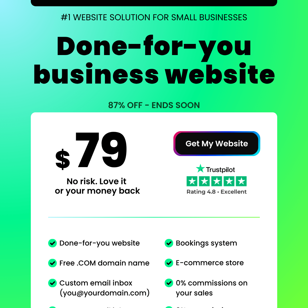
A partir de US$ 79 de taxa de instalação + um plano mensal · Garantia de reembolso de 30 dias 🛡️
As informações estavam corretas no momento da publicação e podem sofrer alterações — sempre confirme no site. Site oficial da UENIContém links de afiliados; informações gerais, não constituindo aconselhamento. ✍️

- Short-Form Video: Reach, Retention and Reality - Outubro 24, 2026
- Outline Generators: The One Part of Scripting Worth Automating - Outubro 24, 2026
- Video Content in 2026: What the Engagement Data Shows - Outubro 21, 2026